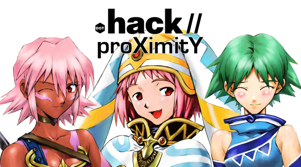
I have now enabled the “featured articles” grid, which should show links to whatever articles I tag with the “featured” tag. Basically, any reviews or fiction articles I post will end up getting linked there. I still don’t have a banner for anime reviews designed, but I’m coming up with ideas; in the meantime, I’m just using screencaps + upscaling, and maybe a little editing.
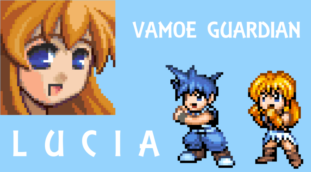
Since I wanted to show them off, here are the other 2014 banners I’ve concocted. You may or may not notice something odd…

 FYI, the Millennium Body banner may change once I have the completed commission. Or I may keep it the way it is now because of that manga look.
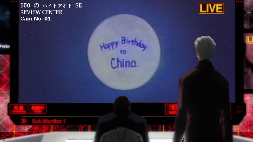
EDIT: Actually, y’know what? Here’s a little something I whipped up for the Review Center:


The edges of Lucia’s portrait on the VGL banner kind of bothers me. I want to suggest having like a gradient fade out instead of a distinct edge, but I’m not sure how much better that would look.
Also, I was confused by the grid for a second coming in, but my screen resolution might be lower than average since my computer’s old. I didn’t realize there was a new post for a second, then I looked at the sidebar. You might wanna think about having the latest blogpost show up in the grid with the older ones as well, even though maybe most people might not have a problem.
Another thing I could do is cut down the grid to 3 instead of 6. The thing about the grid is that anything included in the grid itself doesn’t show up below, which may or may not be a problem; I haven’t had it long enough to really be sure. (Another thing about the grid is that entries look ugly unless they have a featured image that’s the right size).
“The thing about the grid is that anything included in the grid itself doesn’t show up below”
That sounds pretty annoying! Maybe you could select master posts for the three up top? IDK, trying to be helpful.